
Mojo
branding • package design
2017
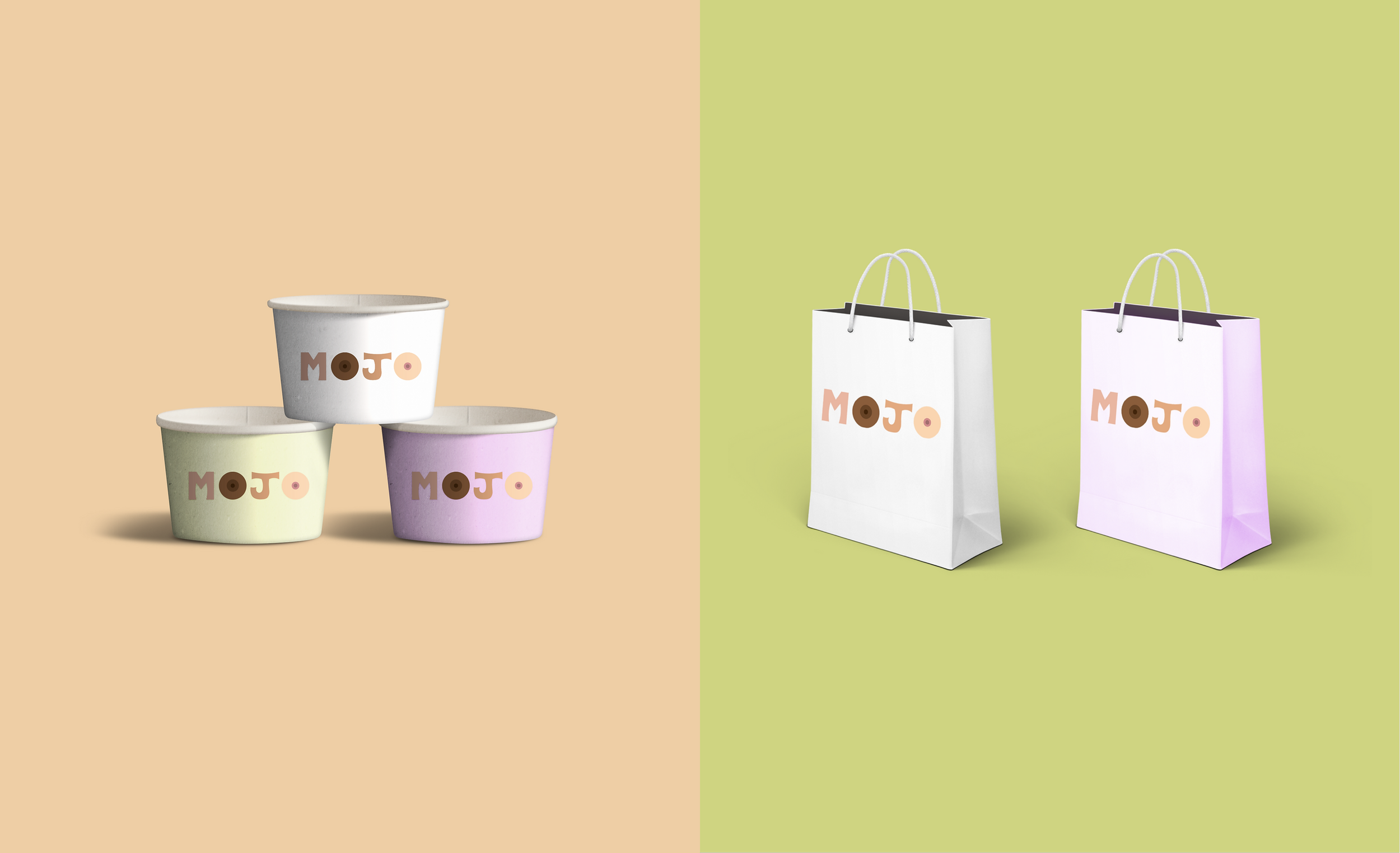
Freelance branding project for a iced fruit store set to open in New York City.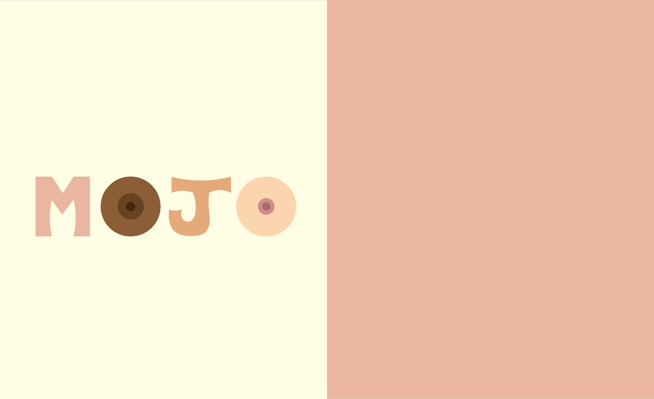
I created a font for Mojo that can be seen in its logo. In choosing Mojo's colors I geared towards earth/body colored tones to reflect the store's focus on health as well as the female body. The pink and green act as contrasting and playful highlights to the otherwise neutral tones. 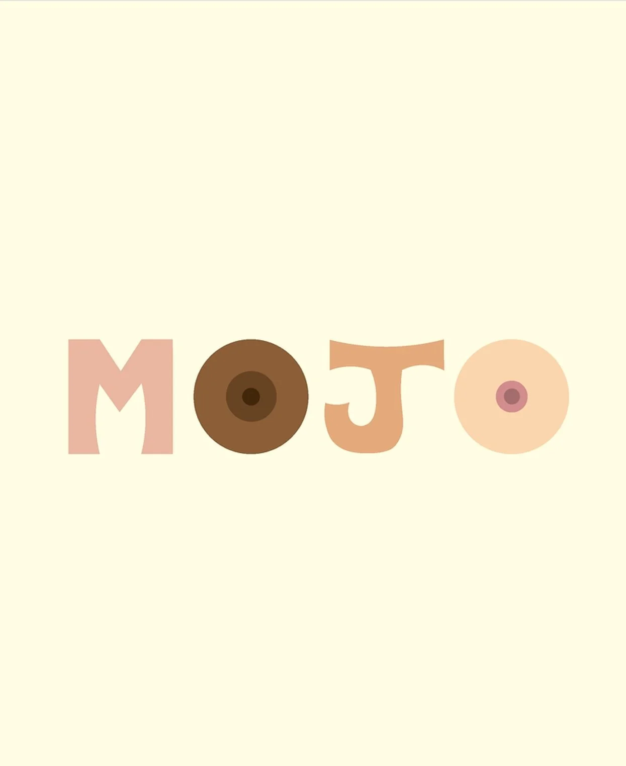

logo
While Mojo's main mission is to provide a healthy alternative to desserts, the store also seeks to break taboos on female sexuality. In addition to selling the iced fruit products it also doubles as a secondary sex shop. I wanted to echo these themes in its logo while still maintaining the lighthearted and humorous nature of the business.


the font
I created a font for Mojo that can be seen in its logo. This font is reserved for large title call outs and the logo. The font takes from a playful retro style.

keep exploring…
ralph lauren / moda operandi / mansur gavriel / victoria’s secret / sevenrooms / case studies / mojo